7. Prepare Survey Data for Analysis and Visualize Data
7.3 Visualizing data and results
Your data analysis will typically include both descriptive and inferential statistics.
- Descriptive statistics are used to describe or summarize your dataset (such as mean scores, frequencies, or percentages).
- Inferential statistics are used to make generalizations or predictions about a population based on data from a sample.
Let’s explore several ways to visually present your descriptive statistics.
In this section, we focus on how to visually present descriptive statistics, which often involve information about your survey participants—such as age, gender, race, marital status, job title, education level, employment status, years of experience, income, or geographic location. These types of data can be effectively communicated using various types of charts.
Pie charts
Pie charts are useful for illustrating the proportion (%) of categorical data, such as gender or job title. For example, if you invited a sample of employees (rather than the entire employee population) to complete your survey, you may want to check whether the characteristics of the respondents (e.g., age groups) reflect those of the broader population.
If your questionnaire included a question about age group, you can use a pie chart to show the proportion of respondents in each group.
- You can break out a slice of the pie to highlight a particular category.
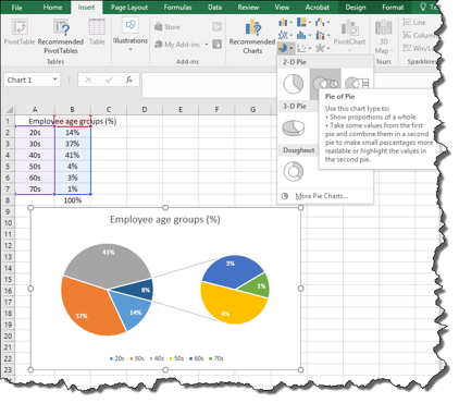
- For categories with small percentages, you can use a “pie of pie” chart to improve readability (Figure 50).
Figure 50 A Sample Pie of Pie Chart
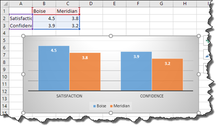
Bar graphs
Bar graphs are helpful when you need to:
- Display frequencies of categorical data, such as racial background or job title (Figure 51)
- Compare categorical data, such as gender or location, side by side (Figure 52)
Figure 51 A Sample Bar Graph Showing Employee Racial Background
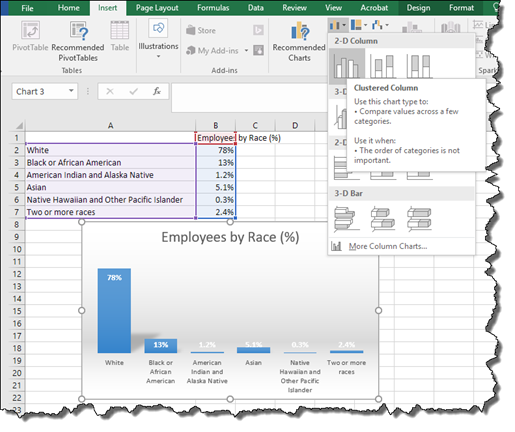
Figure 52 A Sample Bar Graph Comparing Employee Satisfaction and Confidence Levels from Two Locations
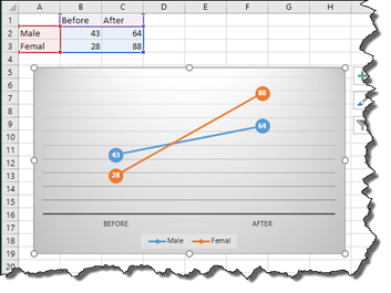
Line graphs
Line graphs are useful when you need to:
- Show trends over time (Figure 53)
- Illustrate interactive results such as changes over time by subgroups (e.g., before-and-after results by gender) (Figure 54)
Figure 53 A Sample Line Graph Showing Monthly Sales
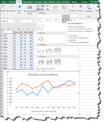
Figure 54 A Sample Line Graph Comparing Before and After Results by Male and Female
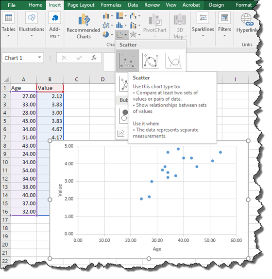
Scatter or bubble chart
A scatter or bubble chart is useful when presenting relationships between two sets of data. For example, you might visualize the relationship between employee age and their perceived value of an organizational strategy (Figure 55).
Figure 55 A Sample Scatter Chart Showing the Relationship Between Employee Age and Their Value Perception