
2 Elements
Learning Objectives
- Identify, define, and discuss the visual elements of design and their use in art and visual communication.
Introduction
Whether an artist creates two-dimensional or three-dimensional art, works in a traditional medium like painting, or makes art using the latest technology, all artists use the same basic visual building blocks of form (elements) and strategies of visual organization (principles) to achieve visual unity. In the next two sections you will learn about the differences between form and content and be introduced to the basic elements and principles of design. You’ll also learn about types of representation in art. All of these concepts are integral to formalism, which is a method of studying artwork by analyzing and describing it purely in terms of visual effects.
Check out this video for a quick (really quick) introduction to formalism:
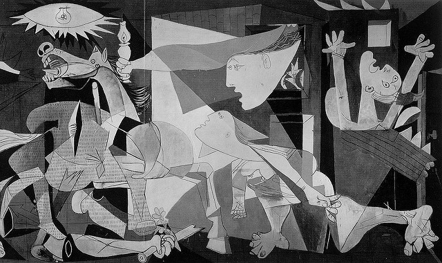
Take a look at Picasso’s painting, Guernica, completed in 1937. At first glance it’s an incredibly busy and complex arrangement of forms. How can formalism be used to provide compositional understanding of this work? How can it be used to analyze and describe the arrangement of forms and how they contribute to a viewer’s experience and interpretation of the painting? Read on, and you’ll find out.
Form and Content
This is an overview of some important terms related to writing about and discussing art. The term formalism comes from critical art theory, which resembles “aesthetics discussion.” Content is basically what the art is about. It is different, slightly, from subject matter which is just what you actually see in a work of art. Content can be better understood as meaning, or purpose of a work of art, although sometimes art can just be about those formal elements without needing to be about “something” literal. This will also touch on point of view (POV), which is an important factor as we look at and discuss artworks.
Viewing Art – Personal Level
When we are looking at art, when we find or “run into” an artwork or exhibition, we typically have an initial response or impression. This response to what we see (or hear, etc.) is formed by a lifetime of knowledge and experience and the culture and time in which we live. The expression “Beauty lies in the eye of the beholder” gets at the subjective and personal nature of perception—and of the “first impression,” in particular. There’s nothing wrong with one’s first impression or response—it is, after all, a personal response. It’s your point of view. But with experience and more exposure to the ways art is made and different points of view your initial response will be more informed. As in everything else in life, ignorance is NOT bliss.
Formal Analysis
Formal analysis is a close and analytical way of looking at and discussing a work of art. It includes describing the work in terms of various design elements, such as line, shape, space/perspective, texture, light, mass, and color, as well as a discussion of how those elements have been used (the design principles). Formal analysis moves beyond a simple description of the artwork and its content by linking the elements of the work to the effects that they have on the viewer. This is discussion of the artwork from the point of view of “here is the artwork, and this is what I see and can make sense of . . .” Formal analysis uses art terminology to consider the effects of an artwork on the viewer (you), and it’s a process that enables us to think about and consider the overall meaning of the work.
NOTE: Formal analysis does not use or require research and is based on your informed POV. The more informed you are, the deeper your analysis will go—but that depth depends on experience and knowledge, not on research.
Content
Content is not simply the subject matter of an artwork. It’s the images you see—like the trees in a painting of a forest, or the town, the sky, and the moon in Van Gogh’s Starry Night, but it’s also about larger purposes or the intent of the artist in that work. Content can play a role in formal analysis, but the content aspect is less important than the “artwork” aspect.
Video: Introducing Formal Analysis: Landscape
Here is another video on formal analysis from the Getty Museum.
Introducing Formal Analysis: Landscape. Authored by: Getty Museum. Located at:. License: All Rights Reserved. License Terms: Standard YouTube license
Elements of Design
Line
A line might best be described as a point moving through space. It is the simplest visual element, but also in many ways the most important. When an artist marks a simple point on a surface, (also referred to as the ground), they immediately create a figure-ground relationship. That is, they divide the work between its surface and anything that “sits” upon it. Our eyes differentiate between the two, and their arrangement has everything to do with how we see a final composition. The line itself can be used as a way to create forms.
Definitions and Qualities of Line
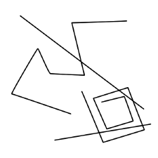
Essentially, when you put two or more points together you create a line. A line can be lyrically defined as a point in motion. There are many different types of lines, all characterized by their length being greater than their width.
Lines can be static or dynamic depending on how the artist chooses to use them. They help determine the motion, direction and energy in a work of art. We see line all around us in our daily lives; telephone wires, tree branches, jet contrails and winding roads are just a few examples. Look at the photograph below to see how line functions as part of natural and constructed environments.
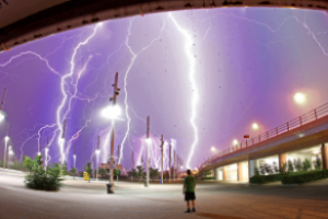
In this image of a lightning storm we can see many different lines. Certainly the jagged, meandering lines of the lightning itself dominate the image, followed by the straight lines of the light standards, the pillars holding up the overpass on the right and the guard rails attached to its side. There are more subtle lines too, like the gently arced line at the top of the image and the shadows cast by the poles and the standing figure in the middle. Lines are even implied by falling water droplets in the foreground. Implied lines are not literally there, but are supplied by our eye and brain as we trace the movement of things in a picture or our environment.
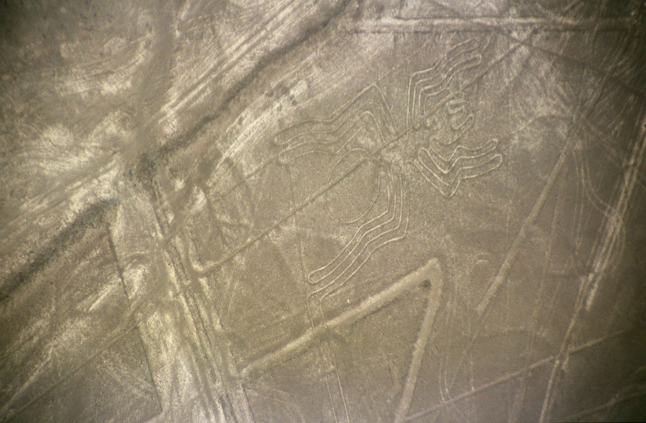
The Nazca lines in the arid coastal plains of Peru date to nearly 500 BCE were scratched into the rocky soil, depicting animals on an incredible scale – so large that they are best viewed from the air. Let’s look at how the different kinds of line are made.
Diego Velazquez’s Las Meninas from 1656, ostensibly a portrait of the Infanta Margarita, the daughter of King Philip IV and Queen Mariana of Spain, offers a sumptuous amount of artistic genius; its sheer size (almost ten feet square), painterly style of naturalism, lighting effects, and the enigmatic figures placed throughout the canvas – including a self-portrait of the artist – is one of the great paintings in western art history. Let’s examine it (below) to uncover how Velazquez uses basic elements and principles of art to achieve such a masterpiece.
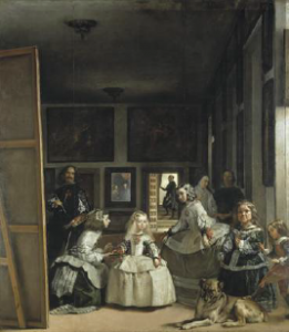
Actual lines are those that are physically present. The edge of the wooden stretcher bar at the left of Las Meninas is an actual line, as are the picture frames in the background and the linear decorative elements on some of the figures’ dresses. How many other actual lines can you find in the painting?
Implied lines are those created by visually connecting two or more areas together. The space between the Infanta Margarita—the blonde central figure in the composition—and the meninas, or maids of honor, to the left and right of her, are implied lines. You might follow the eyes of the meninas to determine an implied line, or imagine a line along the tops of the three heads of the group. Both set up a diagonal relationship that implies movement. By visually connecting the space between the heads of all the figures in the painting we have a sense of jagged motion that keeps the lower part of the composition in motion, balanced against the darker, more static upper areas of the painting. Implied lines can also be created when two areas of different colors or tones come together. Look for more implied lines in the painting.
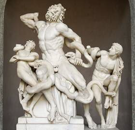
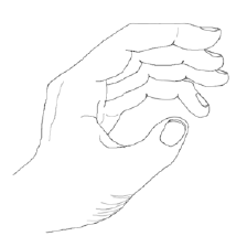
Implied lines are found in three-dimensional artworks, too. The sculpture of the Laocoön (pronounced Lao’ –as in allow – co as in co-operate – and on as in on the table) below, a figure from Greek and Roman mythology, is, along with his sons, being strangled by sea snakes sent by the goddess Athena as wrath against his warnings to the Trojans not to accept the Trojan horse. The sculpture sets implied lines in motion as the figures writhe in agony against the snakes.
Straight or classic lines provide structure to a composition. They can be oriented to the horizontal, vertical, or diagonal axis of a surface. Straight lines are by nature visually stable, while still giving direction to a composition. In Las Meninas, you can see them in the canvas supports on the left, the wall supports and doorways on the right, and in the background in matrices on the wall spaces between the framed pictures. Moreover, the small horizontal lines created in the stair edges in the background help anchor the entire visual design of the painting.
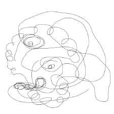
Line quality is that visual sense of character embedded in the way a line presents itself. Certain lines have qualities that distinguish them from others. Hard-edged, jagged lines have a hard staccato visual movement while organic, flowing lines create a more comfortable feeling. Lines can be either geometric or organic, and you can see in the examples how their indeterminate paths animate a surface to different degrees.
Expressive lines are curved, adding an organic, more dynamic character to a work of art. We describe lines or objects with curved lines as being “organic” in nature because most things in nature are made from curving lines. Expressive lines are often rounded and follow undetermined paths. In Las Meninas you can see them in the aprons on the girls’ dresses and in the dog’s folded hind leg and coat pattern. Look again at the Laocoön to see expressive lines in the figures’ flailing limbs and the sinuous form of the snakes. Indeed, the sculpture seems to be made up of nothing but expressive, organic, curving lines, shapes and forms.
We think of horizontal lines as being visually calming like the surface of water. Vertical lines suggest to us very stable visuals, like tree trunks or the columns on a classical building. Diagonal lines read as the most active – think of a cartoon character about to break into a run – it leans forward, and further forward, then bursts away in a cloud of dust.
There are other kinds of line that encompass the characteristics of those above yet taken together help create additional artistic elements and richer, more varied compositions. Refer to the images and examples below to become familiar with these types of line.
Outline, is the simplest of these. They create a path around the edge of a shape. In fact, outlines define shapes.
Contour lines follow paths across a shape to delineate differences in surface features. They give flat shapes a sense of form (the illusion of three dimensions), and can also be used to create shading. Think of a contour map showing the elevation of mountains on the flat surface of the paper.
Hatch lines are repeated at short intervals in generally one direction. They give shading and visual texture to the surface of an object. We will discuss hatching and cross-hatching further when we discuss the element Light.
Although line as a visual element generally plays a supporting role in visual art, there are wonderful examples in which line carries a strong cultural significance as the primary subject matter. Calligraphic lines use quickness and gesture, more akin to paint strokes, to imbue an artwork with a fluid, lyrical character. To see this unique line quality, view a more geometric example from the Koran, created in the Arabic calligraphic style, dates from the 9th century and when employed on sacred texts like the Koran is understood as a kind of devotional activity. While there are several different types or forms of calligraphy in the Islamic tradition – we will consider this in more detail in the section on Islamic art – the intention and reception of the work is the same.

American artist Mark Tobey (1890–1976) was influenced by Oriental calligraphy, adapting its form to the act of pure painting within a modern abstract style which was described as “white writing.”
Tobey studied brushwork in China and Japan. He lived for a time in a Zen monastery. This example of his “white writing” technique shows his interest in the delicate calligraphy of the East and the Western tradition of drawing. Here he marries the two through an interconnected web of strokes and marks.
http://www.artic.edu/aic/collections/artwork/23370
Shapes: Positive, Negative and Planar Issues
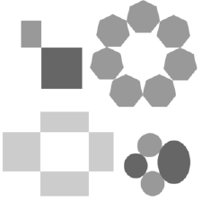
A shape is defined as an enclosed area in two dimensions. By definition shapes are always implied and flat in nature. They can be created in many ways, the simplest by enclosing an area with an outline. They can also be made by surrounding an area with other shapes or the placement of different textures next to each other—for instance, the shape of an island surrounded by water. Because they are more complex than lines, shapes do much of the heavy lifting in arranging compositions. The abstract examples below give us an idea of how shapes are made.
Referring back to Velazquez’s Las Meninas, it is fundamentally an arrangement of shapes; organic and hard-edged, light, dark and mid-toned, that solidifies the composition within the larger shape of the canvas. Looking at it this way, we can view any work of art, whether two or three-dimensional, realistic, abstract or non-objective, in terms of shapes alone.
Positive/Negative Shapes and Figure/Ground Relationships
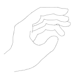
Shapes animate figure-ground relationships. We visually determine positive shapes (the figure) and negative shapes (the ground). One way to understand this is to open your hand and spread your fingers apart. Your hand is the positive shape, and the space around it becomes the negative shape. You can also see this in the example above. The shape formed by the black outline becomes positive because it’s enclosed. The area around it is negative.
Identifying positive and negative shapes can get tricky in a more complex composition. For instance, an implied shape can be created by other shapes or colors that surround it. Deciding on what is positive and negative in that case can be more difficult.
Remember that a positive shape is one that is most distinguished from the background. In Las Meninas the figures become the positive shapes because they are lit dramatically and hold our attention against the dark background. What about the dark figure standing in the doorway? Here the dark shape becomes the positive one, surrounded by a white background. Our eyes always return to this figure as an anchor to the painting’s entire composition. In three dimensions, positive shapes are those that make up the actual work. The negative shapes are the empty spaces around, and sometimes permeating through the work itself. “Holes” or empty spaces in sculpture can also be described as negative spaces; the Laocoön contains good examples of this.
Space
Space is the empty area surrounding real or implied objects. Humans categorize space: there is outer space, that limitless void we enter beyond our sky; inner space, which resides in people’s minds and imaginations, and personal space, the important but intangible area that surrounds each individual and which is violated if someone else gets too close. Pictorial space is flat, and the digital realm resides in cyberspace. Art responds to all of these kinds of space.
Clearly artists are as concerned with space in their works as they are with, say, color or form. During the Renaissance this idea was radically transformed and was arguably the most significant element in art until the modern era. There are many ways for the artist to present ideas of space. Remember that many cultures traditionally use pictorial space as a window to view “realistic” subject matter through, and through the subject matter they present ideas, narratives and symbolic content. The innovation of linear perspective, an implied geometric pictorial construct dating from fifteenth-century Europe (the Renaissance), attempts to create the accurate illusion of three-dimensional space on a flat surface, and appears to recede into the distance through the use of a horizon line and vanishing points. See how linear perspective is set up in the schematic examples below:
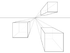
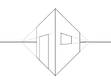
One-point perspective occurs when the receding lines appear to converge at a single point on the horizon and used when the flat front of an object is facing the viewer. Note: Perspective can be used to show the relative size and recession into space of any object, but linear perspective is created through hard-edged three-dimensional objects such as buildings.
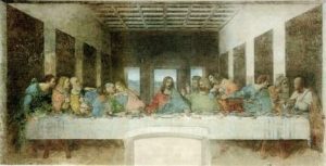
A classic Renaissance artwork using one point perspective is Leonardo da Vinci’s The Last Supper from 1498. Da Vinci composes the work by locating the vanishing point directly behind the head of Christ, thus drawing the viewer’s attention to the center. His arms mirror the receding wall lines, and, if we follow them as lines, would converge at the same vanishing point.
Two-point perspective occurs when the vertical edge of a cube is facing the viewer, exposing two sides that recede into the distance, one to each vanishing point.
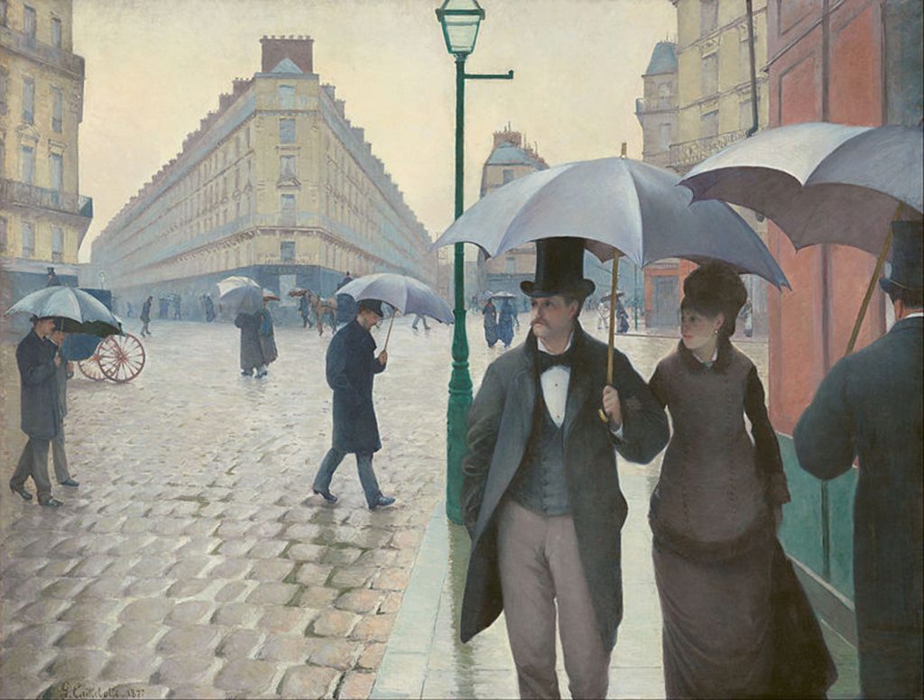
View Gustave Caillebotte’s Paris Street, Rainy Day from 1877 to see how two-point perspective is used to give an accurate view to an urban scene. The artist’s composition, however, is more complex than just his use of perspective. The figures are deliberately placed to direct the viewer’s eye from the front right of the picture to the building’s front edge on the left, which, like a ship’s bow, acts as a cleaver to plunge both sides toward the horizon. In the midst of this visual recession a lamp post stands firmly in the middle to arrest our gaze from going right out the back of the painting. Caillebotte includes the little metal arm at the top right of the post to direct us again along a horizontal path, now keeping us from traveling off the top of the canvas. As relatively spare as the left side of the work is, the artist crams the right side with hard-edged and organic shapes and forms in a complex play of positive and negative space.
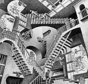
Three-point perspective is used when an artist wants to project either a “bird’s-eye view” (looking down from above) or a “worm’s-eye-view” (looking up from below); that is, when the projection lines recede to two points on the horizon and a third either far above or below the horizon line three-point perspective is employed. In this case the parallel lines that make up the sides of an object are not parallel to the edge of the ground the artist is working on (paper, canvas, etc). Escher was an artist who used both kinds of three-point perspective in prints and drawings like the one below.
The perspective system is a cultural convention well suited to a traditional western European idea of the “truth,” that is, an accurate, clear rendition of observed reality.
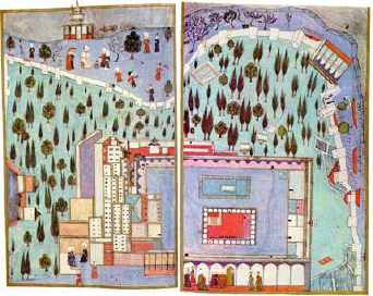
Even after the invention of linear perspective, many cultures, especially in Eastern countries, traditionally use a flatter pictorial space, relying on overlapped shapes or size differences in forms to indicate this same truth of observation. Examine the miniature painting of the Third Court of the Topkapi Palace from fourteenth-century Turkey to contrast its pictorial space with that of linear perspective. It’s composed from a number of different vantage points (as opposed to vanishing points), all very flat to the picture plane. While the overall image is seen from above, the figures and trees appear as cutouts, seeming to float in mid air. Notice the towers on the far left and right are sideways to the picture plane. As “incorrect” as it looks to a western eye, the painting gives a detailed description of the landscape and structures on the palace grounds.
After nearly five hundred years using linear perspective, western ideas about how space is depicted accurately in two dimensions went through a revolution at the beginning of the 20th century. A young Spanish artist, Pablo Picasso, moved to Paris, then western culture’s capital of art, and largely reinvented pictorial space with the invention of Cubism, ushered in dramatically by his painting Les Demoiselles d’Avignon in 1907. He was influenced in part by the chiseled forms, angular surfaces and disproportion of African sculpture and mask-like faces of early Iberian artworks. For more information about this important painting, listen to the following question and answer.
Watch this video online:
Picasso, his friend Georges Braque and a handful of other artists struggled to develop a new space that relied on, ironically, the flatness of the picture plane to carry and animate traditional subject matter including figures, still life and landscape. Cubist pictures, and eventually sculptures, became amalgams of different points of view, light sources and planar constructs. It was as if they were presenting their subject matter in many ways at once, all the while shifting foreground, middle ground and background so the viewer is not sure where one starts and the other ends. In an interview, the artist explained Cubism this way: “The problem is now to pass, to go around the object, and give a plastic expression to the result. All of this is my struggle to break with the two-dimensional aspect”(from Alexander Liberman, An Artist in His Studio, 1960, page 113).
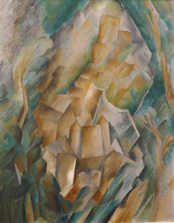
Public and critical reaction to Cubism was understandably negative, but the artists’ experiments with spatial relationships reverberated with others and became – along with new ways of using color – a driving force in the development of a modern art movement that based itself on the flatness of the picture plane. Instead of a window to look into, the flat surface becomes a ground on which to construct formal arrangements of shapes, colors and compositions. For another perspective on this idea, refer back to module one’s discussion of ‘abstraction’. You can see the radical changes Cubism made in George Braque’s landscape La Roche Guyon from 1909. The trees, houses, castle and surrounding rocks comprise almost a single complex form, stair-stepping up the canvas to mimic the distant hill at the top, all of it struggling upwards and leaning to the right within a shallow pictorial space.
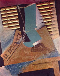
As the cubist style developed, its forms became even flatter. Juan Gris’s The Sunblind from 1914 splays the still life it represents across the canvas. Collage elements like newspaper reinforce pictorial flatness.
It’s not so difficult to understand the importance of this new idea of space when placed in the context of comparable advances in science surrounding the turn of the nineteenth century. The Wright Brothers took to the air with powered flight in 1903, the same year Marie Curie won the first of two Nobel prizes for her pioneering work in radiation. Sigmund Freud’s new ideas on the inner spaces of the mind and its effect on behavior were published in 1902, and Albert Einstein’s calculations on relativity, the idea that space and time are intertwined, first appeared in 1905. Each of these discoveries added to human understanding and realigned the way we look at ourselves and our world. Indeed, Picasso, speaking of his struggle to define cubism, said “Even Einstein did not know it either! The condition of discovery is outside ourselves; but the terrifying thing is that despite all this, we can only find what we know” (from Picasso on Art, A Selection of Views by Dore Ashton, (Souchere, 1960, page 15).
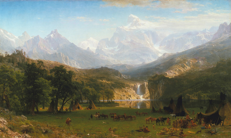
Linear perspective, whether one, two, or three-point, requires straight lines of some sort to follow. It is primarily seen in images of buildings, streets, or the like. In paintings of landscape another kind of perspective is employed. Atmospheric perspective is based on the principle that objects further away appear smaller, grayer, and less distinct. In the world water vapor and other elements in the air create a “haze” that gives distant objects the blurry, bluish-gray quality that we see. Landscape artists employ atmospheric perspective to give a sense of recession in space on a two-dimensional surface such as you see in Albert Bierstadt’s 1863 painting of The Rocky Mountains, Lander’s Peak.
Three-dimensional Objects
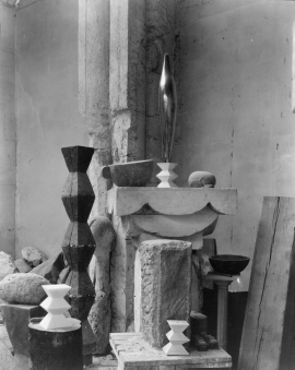
Three-dimensional space doesn’t undergo this fundamental transformation. It remains a visual tug between positive and negative spaces. Sculptors influenced by Cubism do, however, develop new forms to fill this space; abstract and non-objective works that challenge us to see them on their own terms. Constantin Brancusi, a Romanian sculptor living in Paris, became a leading artist to champion the new forms of modern art. His sculpture Bird in Space is an elegant example of how abstraction and formal arrangement combine to symbolize the new movement. The photograph of Brancusi’s studio below gives further evidence of sculpture’s debt to Cubism and the struggle “to go around the object, to give it plastic expression.”
Now that we’ve established line, shape, and spatial relationships, we can turn our attention to surface qualities and their importance in works of art. Value (or tone), color and texture are the elements used to do this.
Light
When we speak of the element of Light in a work of art, we are usually speaking of a two-dimensional work (paintings, drawings, or other work on a flat surface); sculpture is literally lit from outside sources and while those lights, like stage lighting, also allows us to appreciate the planes, shapes, or other elements of a three-dimensional work the actual lighting is external to the work itself. For us, the creation of the illusion of light by the artist in two-dimensions is the most interesting thing. We can think about the ways an artist approaches this in several ways. First, we might think about the range of lights and darks which are sometimes referred to as value.
Value
Value is the relative lightness or darkness of a shape in relation to another. The value scale, bounded on one end by pure white and on the other by black, and in between a series of progressively darker shades of grey, gives an artist the tools to make these transformations. The value scale below shows the standard variations in tones.
Values near the lighter end of the spectrum are termed high-keyed, those on the darker end are low-keyed.

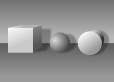
In two dimensions, the use of value gives a shape the illusion of mass and lends an entire composition a sense of light and shadow. The two examples below show the effect value has on changing a shape to a form.

This same technique brings to life what begins as a simple line drawing of a young man’s head in Michelangelo’s Head of a Youth and Right Hand from 1508. Shading is created with line (refer to our discussion of hatching and crosshatching earlier in this module) or tones created with a pencil. Artists vary the tones by the amount of resistance they use between the pencil and the paper they’re drawing on. A drawing pencil’s leads vary in hardness, each one giving a different tone than another. Washes of ink or color create values determined by the amount of water the medium is dissolved into.
Hatching refers to the use of parallel lines laid down beside one another to create areas of shade, the closer together the lines the darker the shade created. Crosshatching is used to create even darker areas of shade by literally “crossing” the first set of hatching lines with a second set on an angle. This is employed mainly in media where only line can be produced, like etching.
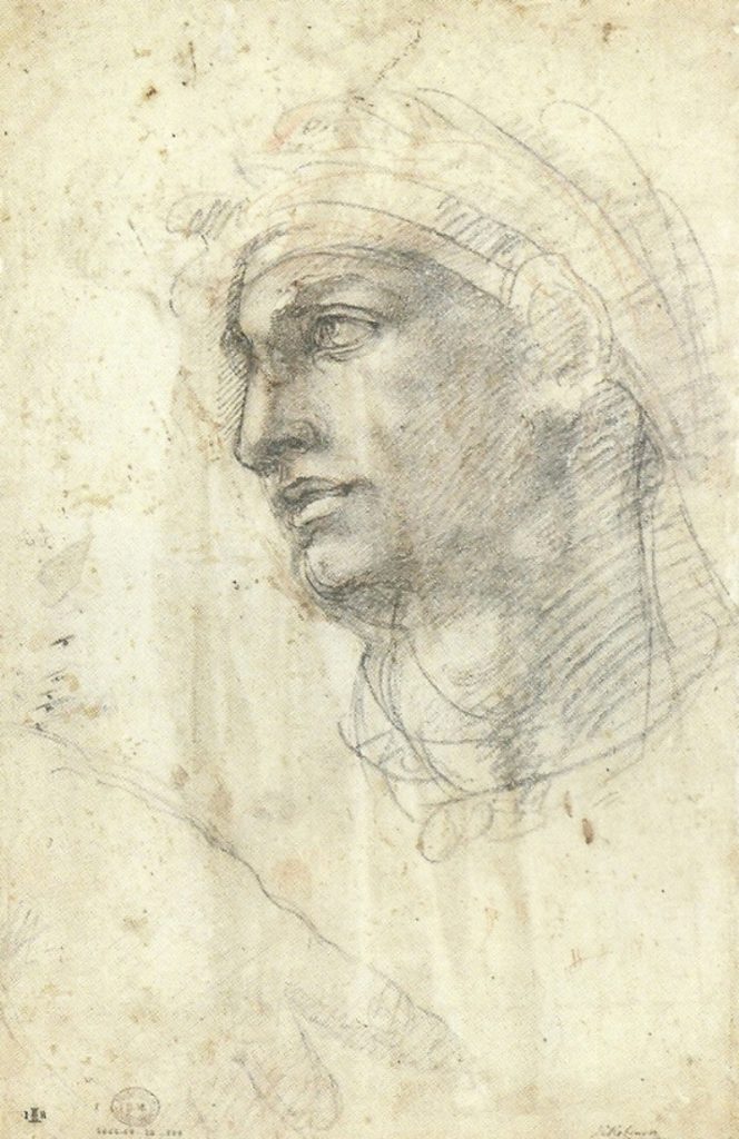
Note Michelangelo’s use of hatching and cross-hatching to create darks and lights. This depiction of shading giving form to a figure is called chiaroscuro – Italian for “dark and light.”
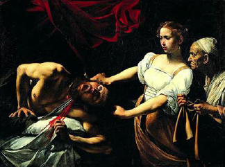
The use of high contrast, placing lighter areas of value against much darker ones, creates a dramatic effect, while low contrast gives more subtle results. These differences in effect are evident in Judith Beheading Holofernes by the Italian painter Caravaggio. Caravaggio uses a high contrast palette to an already dramatic scene to increase the visual tension for the viewer.
Color
Color is the most complex artistic element because of the combinations and variations inherent in its use. Humans respond to color combinations differently, and artists study and use color in part to give desired direction to their work.
Color is fundamental to many forms of art, although in art it is created somewhat differently than in the natural world, although our perception of color is created through the same physical mechanisms. In nature, the full spectrum of colors is contained in white light. Humans perceive colors from the light reflected off objects. A red object, for example, looks red because it reflects the red part of the spectrum. It would be a different color under a different light. Paint is made up of small particles, each of which may have its own color. We perceive and our brains make sense of color depending on things like the light in which we view it, and the individual varieties of our own color perceptors. “Color-blind” people are not really blind to all color, but usually only have the receptors for certain colors.
Color theory first appeared in the 17th century when English mathematician and scientist Sir Isaac Newton discovered that white light could be divided into a spectrum by passing it through a prism.
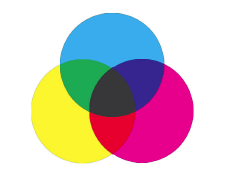
The study of color in art and design often starts with color theory. Color theory splits up colors into three categories: primary, secondary, and tertiary. The basic tool used is a color wheel, developed by Isaac Newton in 1666. A more complex model known as the color tree, created by Albert Munsell, shows the spectrum made up of sets of tints and shades on connected planes. There are a number of approaches to organizing colors into meaningful relationships. Most systems differ in structure only.
Traditional Model
Traditional color theory is a qualitative attempt to organize colors and their relationships. It is based on Newton’s color wheel, and continues to be the most common system used by artists.

• The primary colors are red, blue, and yellow. You find them equidistant from each other on the color wheel. These are the “elemental” colors; not produced by mixing any other colors, and all other colors are derived from some combination of these three.
• The secondary colors are orange (mix of red and yellow), green (mix of blue and yellow), and violet (mix of blue and red).
• Tertiary colors are obtained by mixing one primary color and one secondary color. Depending on the amount of color used, different hues can be obtained such as red-orange or yellow-green. Neutral colors (browns and grays) can be mixed using the three primary colors together.
• White and black lie outside of these categories. They are used to lighten or darken a color. A lighter color (made by adding white to it) is called a tint, while a darker color (made by adding black) is called a shade.
Color Mixing
A more quantifiable approach to color theory is to think about color as the result of light reflecting off a surface. Additive color theory is used when different colored lights are being projected on top of each other. Projected media produce color by projecting light onto a reflective surface. Where subtractive mixing creates the impression of color by selectively absorbing part of the spectrum, additive mixing produces color by selective projection of part of the spectrum. Basically, this is true primarily for colored light. Common applications of additive color theory are theater lighting and television screens. In painting pigments color we see is the result of light rays bouncing off of a surface and others being absorbed, but mixing all of the colors of the prism in paint gives you brownish, grayish mung. In light it gives you white light.
Theoretically, black is mixed using the three primary colors, while white represents the absence of all colors. Note: because of impurities in subtractive color (paint), a true black is impossible to create through the mixture of primaries. Because of this the result is closer to brown. Lightness and darkness of a color is determined by its intensity and density.
Again, the primaries are blue, yellow and red.
Color Attributes
There are many attributes to color. Each one has an effect on how we perceive it.
• Hue refers to color itself, but also to the variations of a color.
• Value (as discussed previously)refers to the relative lightness or darkness of one color next to another. The value of a color can make a difference in how it is perceived. A color on a dark background will appear lighter, while that same color on a light background will appear darker.
• Tone refers to the gradation or subtle changes made to a color when it’s mixed with a gray created by adding two complements (see Complementary Color below). You can see various color tones by looking at the color tree mentioned in the paragraph above.
• Saturation refers to the purity and intensity of a color. The primaries are the most intense and pure, but diminish as they are mixed to form other colors. The creation of tints and shades also diminish a color’s saturation. Two colors work strongest together when they share the same intensity. This is called equiluminance.
Color Interactions
Beyond creating a mixing hierarchy, color theory also provides tools for understanding how colors work together.
Monochrome
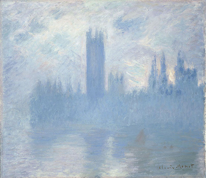
The simplest color interaction is monochrome. This is the use of variations of a single hue. The advantage of using a monochromatic color scheme is that you get a high level of unity throughout the artwork because all the tones relate to one another. See this in Monet’s Untitled (Houses of Parliament, London) from c. 1900.
Analogous Color
Analogous colors are similar to one another – they vibrate visually at a low level. As their name implies, analogous colors can be found next to one another on any 12-part color wheel:

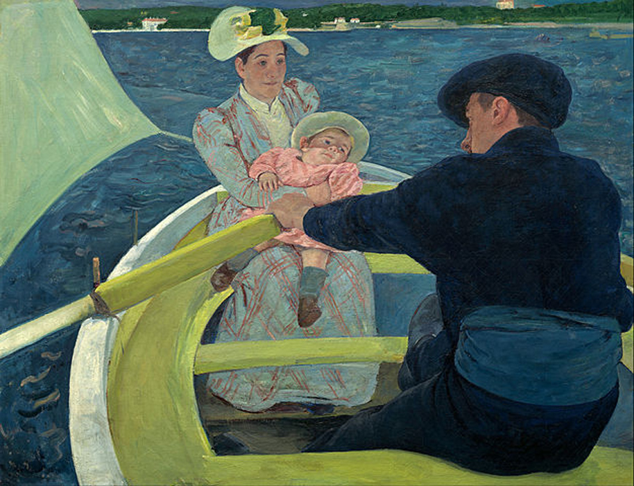
You can see the effect of analogous colors in Mary Cassatt’s The Boating Party. Because the light waves we perceive are more similar, analogous colors tend to create less visual activity than complementary colors and lend themselves to images that suggest a calm atmosphere.
Complementary Colors
Complementary colors are found directly opposite one another on a color wheel. Here are some examples:
• purple and yellow
• green and red
• orange and blue

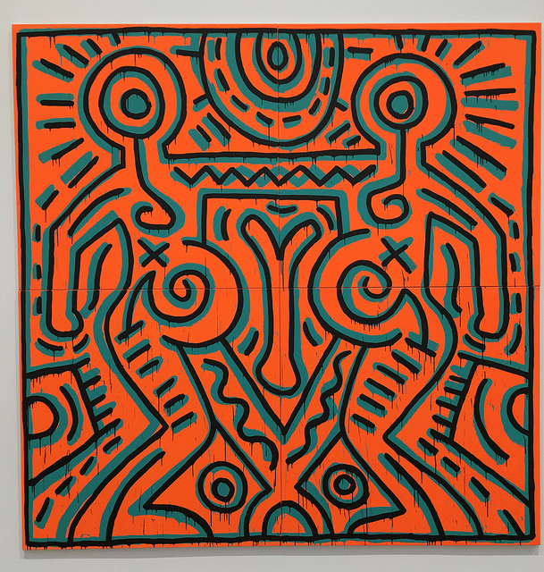
Because they are opposites, they vibrate at a higher, more active level in the eye. Blue and orange are complements. When placed near each other, complements create a visual tension or suggest energy and action. This color scheme is desirable when a dramatic effect is needed using only two colors. The painting Untitled by Keith Haring is an example.
Color Temperature
Colors are perceived to have temperatures associated with them. The color wheel is divided into warm and cool colors. Warm colors range from yellow to red, while cool colors range from yellow-green to violet. You can achieve complex results using just a few colors when you pair them in warm and cool sets.

Simultaneous Contrast
There are other, more complicated qualities of color interactions that its good to be aware of, but not always crucial in understanding a work of art. For example, neutrals on a colored background will appear tinted toward that color’s complement, because the eye attempts to create a balance. (Grey on a red background will appear more greenish, for example.) In other words, the neutral will shift away from the surrounding color. Also, non-dominant colors (i.e. a lighter tint) will also appear in tone more towards the complement of the dominant color. Color interaction affect values, as well. Colors appear darker on or near lighter colors, and lighter on or near darker colors. Complementary colors will look more intense on or near each other than they will on or near grays (refer back to the Keith Haring example above to see this effect).

The Emotional Effect of Color
Often this is also a result of acculturation. Black is the color of funeral wear in the West, white in parts of the East. The emotional effect of color on the viewer is possibly the easiest to understand, but also not always the most reliable. Think about the significance of the relation of emotion to color by the way words are used in our language: I’m feeling “blue”, I was so mad I saw “red”, or I was in a “black” mood. We tend to translate those ideas to things we see – a painter who uses a lot of blue must be trying to communicate sadness. Except maybe not. Try not to attribute simple accepted ideas about the emotional resonance of color to the “meaning” of a painting. If, however, a blue painting makes you feel sad that’s a reasonable reaction to describe. Just be aware that it may not affect everyone in the same way.
Texture and Mass
The last two elements to be introduced are, in many ways, the most obvious. Texture can be understood either literally or visually. In a three dimensional piece of art or architecture it may be made of materials that have literal texture – like rough stone or smooth felt. In a two dimensional work – drawing, painting, print or anything else on a flat surface – texture is implied visually.
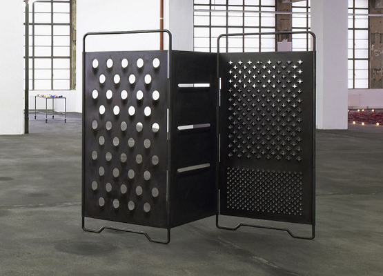
Mona Hatoum is a Lebanese-born Palestinian artist who lives in London. Her work in video, sculpture, and installation often investigates issues of identity – especially that of Muslim women. The objects are often uncomfortable and speak directly to the physical experience of Otherness in the West or – in the case of gender – anywhere. Here a basic room divider is made of steel – a hard, cold metal – and perforated with shapes that suggest things hidden but partially visible, or seen only through a controlled barrier. Genders have traditionally been separated in certain cultures – arguably in most – by the physical spaces some are allowed to occupy as well as by the kinds of clothing and parts of the body allowed to be seen in public.
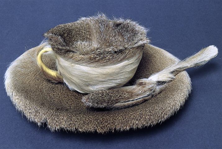
Surrealist artist Meret Oppenheim used two inherently opposite ideas – fur and food – to create her Object. Even in a photograph we understand how this object would feel, either in our hand or against our lips. Texture is one of the more counter-intuitive of the elements, but as in Object it can be incredibly powerful.
Mass
This is a term we use when describing three-dimensional objects – sculpture and architecture primarily. Mass suggests weight, density, and bulk.
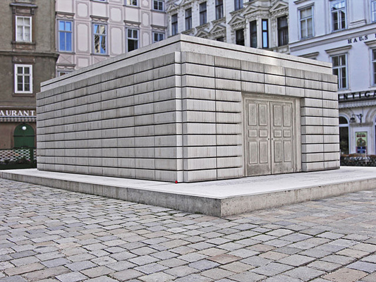
Rachel Whiteread is a British artist whose work is often concerned with memory and loss as signified by physical structures. Here the Holocaust Memorial, also called the Nameless Library, stands in Judenplatz in Vienna, Austria as a memorial to all of the Austrian Jewish victims of the Nazis in WWII.
The steel and concrete structure stands 3.8 meters tall and is made of cast library shelves turned inside out. The spines of the books are facing inwards and are unreadable. The Jewish people are known as “The People of the Book” and the ideas of void, mass, and negative spaces that Whiteread is known for here suggest a particularly poignant sense of loss and tragedy. Mass is obvious in this bunker-like construction.
The elements described here create a kind of vocabulary with which you can begin to think and write about art. But all languages need more than just words to communicate. The Principles of Art which we encounter next will act as the grammar and syntax with which artists put together these elements in a satisfying whole.
Licensing and Attribution
© Saylor Academy 2010-2018 except as otherwise noted. Creative Commons Attribution 3.0 Unported license. Third-party materials are the copyright of their respective owners and shared under various licenses. Saylor Academy and Saylor.org® are trade names of the Constitution Foundation, a 501(c)(3) organization through which our educational activities are conducted.
Licensing & Attributions CC licensed content, Shared previously
• Artistic Elements. Authored by: Christopher Gildow. Located at: https://learn.canvas.net/courses/24/modules#module_19. Project: Open Course Library. License: CC BY-NC-SA: Attribution-NonCommercial-ShareAlike
All rights reserved content
VIDEOS: ELEMENTS OF ART
Watch this video online: https://youtu.be/videoseries
Licensing & Attributions
All rights reserved content
• Elements of Art. Provided by: KQED Art School. Located at: https://www.youtube.com/playlist?list=PLiOil1qP-cMURN_8baOr3QWfySmIjqKIj. License: All Rights Reserved. License Terms: Standard YouTube license
