
3 Principles of Design
Learning Objectives
- Identify and distinguish how the principles of design are used to visually organize the elements of design.
Art As Visual Input
Visual art manifests itself through media, ideas, themes and sheer creative imagination. Yet all of these rely on basic structural principles that, like the elements we’ve been studying, combine to give voice to artistic expression. Incorporating the principles into your artistic vocabulary not only allows you to objectively describe artworks you may not understand, but contributes in the search for their meaning.
The first way to think about a principle is that it is something that can be repeatedly and dependably done with elements to produce some sort of visual effect in a composition – the arrangement of objects, elements, forms and/or colors in a work of art. The principles are based on sensory responses to visual input: elements APPEAR to have visual weight, movement, etc. The principles help govern what might occur when particular elements are arranged in a particular way. Using a chemistry analogy, the principles are the ways the elements “stick together” to make a “chemical” (in our case, an image).
Principles can be confusing. There are at least two very different but correct ways of thinking about principles. On the one hand, a principle can be used to describe an operational cause and effect such as “bright things come forward and dull things recede”. On the other hand, a principle can describe a high quality standard to strive for such as “unity is better than chaos” or “variation beats boredom” in a work of art. So, the word “principle” can be used for very different purposes.
Another way to think about a principle is that it is a way to express a value judgment about a composition. Any list of these effects may not be comprehensive, but there are some that are more commonly used (unity, balance, etc). When we say a painting has unity we are making a value judgment. Too much unity without variety is boring and too much variation without unity is chaotic.
The principles of design help you to carefully plan and organize the elements of art so that you will hold interest and command attention. This is sometimes referred to as visual impact. In any work of art there is a thought process for the arrangement and use of the elements of design. The artist who works with the principles of good composition will create a more interesting piece; it will be arranged to show a pleasing rhythm and movement. The center of interest will be strong and the viewer will not look away, instead, they will be drawn into the work. A good knowledge of composition is essential in producing good artwork. Some artists today like to bend or ignore these rules and by doing so are experimenting with different forms of expression. The following page explores important principles in composition.
The Principles we will learn to employ are Unity and Variety, Balance, Emphasis and Subordination (Focal Point), Scale and Proportion, Rhythm and Repetition, and Time and Motion.
Unity and Variety
Ultimately, a work of art is the strongest when it expresses an overall unity in composition and form, a visual sense that all the parts fit together; that the whole is greater than its parts. This same sense of unity is projected to encompass the idea and meaning of the work too. This visual and conceptual unity is sublimated by the variety of elements and principles used to create it. We can think of this in terms of a musical orchestra and its conductor: directing many different instruments, sounds and feelings into a single comprehendible symphony of sound. This is where the objective functions of line, color, pattern, scale and all the other artistic elements and principles yield to a more subjective view of the entire work, and from that an appreciation of the aesthetics and meaning it resonates.
We can view Eva Isaksen’s work Orange Light below to see how unity and variety work together.
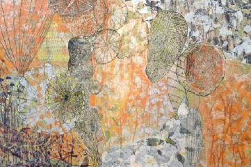
Isaksen makes use of nearly every element and principle including shallow space, a range of values, colors and textures, asymmetrical balance and different areas of emphasis. The unity of her composition stays strong by keeping the various parts in check against each other and the space they inhabit. In the end the viewer is caught up in a mysterious world of organic forms that float across the surface like seeds being caught by a summer breeze.
Visual Balance
All works of art possess some form of visual balance – a sense of weighted clarity created in a composition. The artist arranges balance to set the dynamics of a composition. A really good example is in the work of Piet Mondrian, whose revolutionary paintings of the early twentieth century used nonrepresentational or nonobjective balance instead of realistic subject matter to generate the visual power in his work.
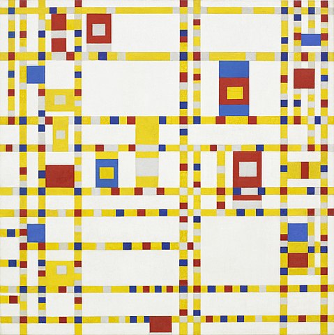
Notice how the bright red shapes are placed around the picture plane so that each side appears to be weighted equally with the others.
In the examples below you can see that where the white rectangle is placed makes a big difference in how the entire picture plane is activated.
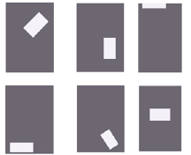
The example on the top left is weighted toward the top, and the diagonal orientation of the white shape gives the whole area a sense of movement. The top middle example is weighted more toward the bottom, but still maintains a sense that the white shape is floating. On the top right, the white shape is nearly off the picture plane altogether, leaving most of the remaining area visually empty. This arrangement works if you want to convey a feeling of loftiness or simply direct the viewer’s eyes to the top of the composition. The lower left example is perhaps the least dynamic: the white shape is resting at the bottom, mimicking the horizontal bottom edge of the ground. The overall sense here is restful, heavy and without any dynamic character. The bottom middle composition is weighted decidedly toward the bottom right corner, but again, the diagonal orientation of the white shape leaves some sense of movement. Lastly, the lower right example places the white shape directly in the middle on a horizontal axis. This is visually the most stable, but lacks any sense of movement. Refer to these six diagrams when you are determining the visual weight of specific artworks.
There are three basic forms of visual balance:
- Symmetrical
- Asymmetrical
- Radial

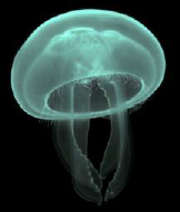
Symmetrical balance is the most visually stable, and characterized by an exact—or nearly exact—compositional design on either (or both) sides of the horizontal or vertical axis of the picture plane. Symmetrical compositions are usually dominated by a central anchoring element. There are many examples of symmetry in the natural world that reflect an aesthetic dimension. The Moon Jellyfish fits this description; ghostly lit against a black background, but absolute symmetry in its design.
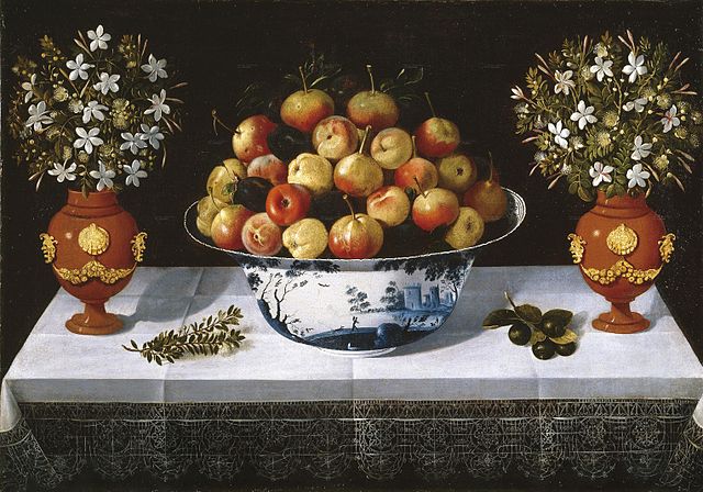
This Spanish Baroque still life is an example of a symmetrical composition. Even though the branch on the table on the left is different from the round fruited branch on the right they are of about the same shape, placement, size, and darkness.
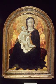
Sano di Pietro’s Madonna of Humility, painted around 1440, is centrally positioned, holding the Christ child and forming a triangular design, her head the apex and her flowing gown making a broad base at the bottom of the picture. Their halos are visually reinforced with the heads of the angels and the arc of the frame. While not literally symmetrical, the image is balanced by forms.
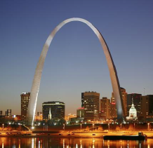
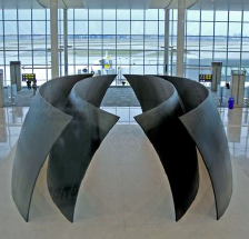
The use of symmetry is evident in three-dimensional art, too. A famous example is the Gateway Arch in St. Louis, Missouri (below). Commemorating the westward expansion of the United States, its stainless steel frame rises over 600 feet into the air before gently curving back to the ground. Another example is Richard Serra’s Tilted Spheres (also below). The four massive slabs of steel show a concentric symmetry and take on an organic dimension as they curve around each other, appearing to almost hover above the ground.
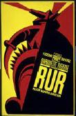
Asymmetry uses compositional elements that are offset from each other, creating a visually unstable balance. Asymmetrical visual balance is the most dynamic because it creates a more complex design construction. A graphic poster from the 1930s shows how offset positioning and strong contrasts can increase the visual effect of the entire composition.
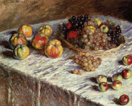
Claude Monet’s Still Life with Apples and Grapes from 1880 (below) uses asymmetry in its design to enliven an otherwise mundane arrangement. First, he sets the whole composition on the diagonal, cutting off the lower left corner with a dark triangle. The arrangement of fruit appears haphazard, but Monet purposely sets most of it on the top half of the canvas to achieve a lighter visual weight. He balances the darker basket of fruit with the white of the tablecloth, even placing a few smaller apples at the lower right to complete the composition. Monet and other Impressionist painters were influenced by Japanese woodcut prints, whose flat spatial areas and graphic color appealed to the artist’s sense of design.
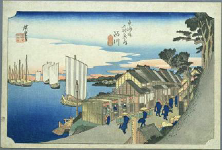
One of the best-known Japanese print artists is Ando Hiroshige. You can see the design strength of asymmetry in his woodcut Shinagawa on the Tokaido (below), one of a series of works that explores the landscape around the Takaido road.
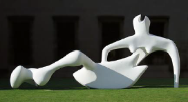
In Henry Moore’s Reclining Figure the organic form of the abstracted figure, strong lighting and precarious balance obtained through asymmetry make the sculpture a powerful example in three-dimensions.
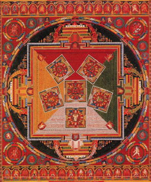
Radial balance suggests movement from the center of a composition towards the outer edge—or vise versa. Many times radial balance is another form of symmetry, offering stability and a point of focus at the center of the composition. Buddhist mandala paintings offer this kind of balance almost exclusively. The image radiates outward from a central spirit figure. In the example below there are six of these figures forming a star shape in the middle. Here we have absolute symmetry in the composition, yet a feeling of movement is generated by the concentric circles within a rectangular format.
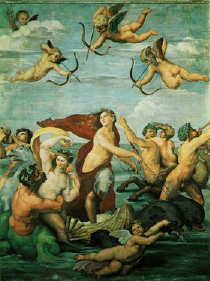
Raphael’s painting of Galatea, a sea nymph in Greek mythology, incorporates a double set of radial designs into one composition. The first is the swirl of figures at the bottom of the painting, the second being the four cherubs circulating at the top. The entire work is a current of figures, limbs and implied motion. Notice too the stabilizing classic triangle formed with Galatea’s head at the apex and the other figures’ positions inclined towards her. The cherub outstretched horizontally along the bottom of the composition completes the second circle.
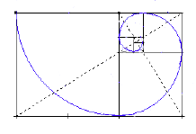
Within this discussion of visual balance, there is a relationship between the natural generation of organic systems and their ultimate form. This relationship is mathematical as well as aesthetic, and is expressed as the Golden Ratio:
Watch this video online:
Here is an example of the golden ratio in the form of a rectangle and the enclosed spiral generated by the ratios:
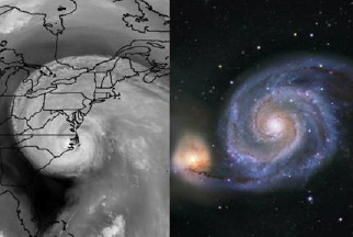
The natural world expresses radial balance, manifest through the golden ratio, in many of its structures, from galaxies to tree rings and waves generated from dropping a stone on the water’s surface. You can see this organic radial structure in some natural systems by comparing the satellite image of hurricane Isabel and a telescopic image of spiral galaxy M51 below.
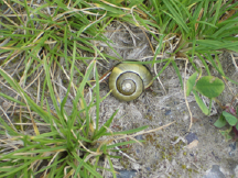
A snail shell, unbeknownst to its inhabitant, is formed by this same universal ratio, and, in this case, takes on the green tint of its surroundings.
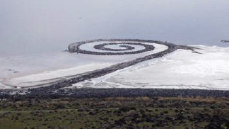
Environmental artist Robert Smithson created Spiral Jetty, an earthwork of rock and soil, in 1970. The jetty extends nearly 1500 feet into the Great Salt Lake in Utah as a symbol of the interconnectedness of ourselves to the rest of the natural world.
Emphasis and Subordination
Emphasis—the area of primary visual importance—can be attained in a number of ways. We’ve just seen how it can be a function of differences in scale. Emphasis can also be obtained by isolating an area or specific subject matter through its location or color, value and texture. Main emphasis in a composition is usually supported by areas of lesser importance, or subordination – a hierarchy within an artwork that’s activated and sustained at different levels.
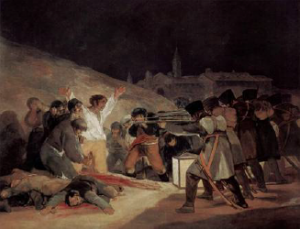
Like other artistic principles, emphasis can be expanded to include the main idea contained in a work of art. Let’s look at the following work to explore this. We can clearly determine the figure in the white shirt as the main emphasis in Francisco de Goya’s painting The Third of May, 1808 below. Even though his location is left of center, a candle lantern in front of him acts as a spotlight, and his dramatic stance reinforces his relative isolation from the rest of the crowd. He becomes the focal point of our interest.
Moreover, the soldiers with their aimed rifles create an implied line between them selves and the figure. There is a rhythm created by all the figures’ heads—roughly all at the same level throughout the painting—that is continued in the soldiers’ legs and scabbards to the lower right. Goya counters the horizontal emphasis by including the distant church and its vertical towers in the background. You might also think about this in terms of implied line – a horizontal line made by the tops of the soldiers’ heads.
In terms of the idea, Goya’s narrative painting gives witness to the summary execution of Spanish resistance fighters by Napoleon’s armies on the night of May 3, 1808. He poses the figure in the white shirt to imply a crucifixion, a Christ-like figure about to be sacrificed, as he faces his own death and his compatriots surrounding him either clutch their faces in disbelief or stand stoically with him, looking their executioners in the eyes. While the carnage takes place in front of us, the church stands dark and silent in the distance. The genius of Goya is his ability to direct the narrative content by the emphasis he places in his composition.
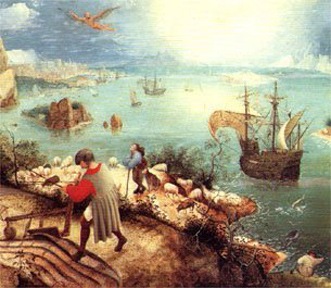
A second example showing emphasis is seen in The Fall of Icarus, by Pieter Brueghel the Elder (or one of his circle). There is a multitude of activity recorded in this painting. The most insignificant – or subordinate – image is probably the body of the title figure on the lower right. The thing that immediately draws our eye, however, is the bright red shirt of the plowman. Here color provides the emphasis and underscores the moral of the story – life goes on. One person’s catastrophe doesn’t interrupt the daily routine of the other figures.
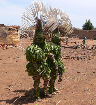
A final example on emphasis, taken from The Art of Burkina Faso by Christopher D. Roy, University of Iowa, covers both design features and the idea behind the art. Many world cultures include artworks in ceremony and ritual. African Bwa Masks are large, often graphically painted and usually attached to fiber costumes that cover the head. They depict mythic characters and animals or are abstract and have a stylized face with a tall, rectangular wooden plank attached to the top. In any manifestation, the mask and the dance for which they are worn are inseparable. They become part of a community outpouring of cultural expression and emotion.
Scale and Proportion
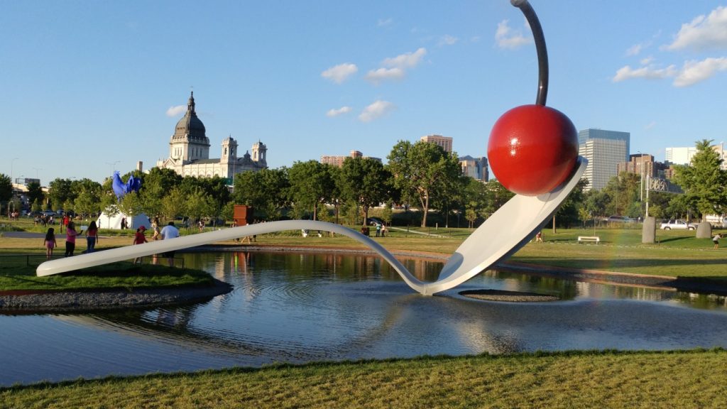
Scale and proportion show the relative size of one form in relation to another. Relationships of scale are often used to create illusions of depth on a two-dimensional surface, the larger form being in front of the smaller one. The scale of an object can provide a focal point or emphasis in an image. Scale is used to point out relationships of size relative to the human body. Things on a human scale are the size we expect them to be in relation to the norm. American sculptor Claes Oldenburg and his wife Coosje van Bruggen create works of common objects at an unexpected and enormous scale. Their Spoonbridge and Cherry at the Walker Art Center in Minneapolis weighs almost 7000 lbs. As big as it is, the work retains a comic and playful character, in part because of its gigantic size. This kind of sculpture lends itself to public art because it appeals to most viewers of all ages.
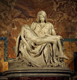
Scale and proportion are incremental in nature. Works of art don’t always rely on big differences in scale to make a strong visual impact. A good example of this is Michelangelo’s sculptural masterpiece Pieta from 1499 (below). Here Mary cradles her dead son, the two figures forming a stable triangular composition. Michelangelo sculpts Mary to a slightly larger scale than the dead Christ to give the central figure more significance, both visually and psychologically. It also helps make the image of a young woman with the body of a grown man in her lap seem believable.
Some cultures have used scale to indicate relative importance. The Egyptians pictured their pharaohs as significantly larger than any of the lesser figures pictured around them. This kind of scale is called hierarchical.
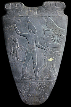
Here the Pharaoh Narmer defeats his enemies which are pictured as significantly smaller. Smaller still is the servant behind him who carries his shoes.
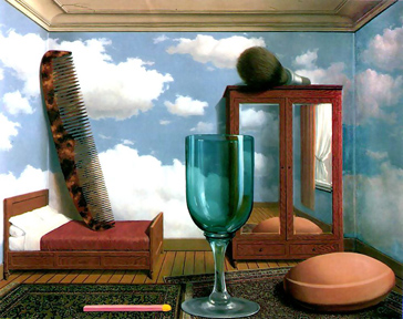
When scale and proportion are greatly increased the results can be impressive, giving a work commanding space or fantastic implications. Rene Magritte’s painting Personal Values constructs a room with objects whose proportions are so out of whack that it becomes an ironic play on how we view everyday items in our lives. The Surrealists often employed the principle of scale in exaggerated ways to create their unexpected and often unsettling images.
Proportion refers to the relationships of parts in a whole. When a figure is given an oversized head compared to the rest of the body we would say that it is either out of proportion or in an exaggerated proportion (out of proportion suggests a mistake).
Rhythm and Repetition or Pattern
Repetition/Pattern is the use of two or more like elements or forms within a composition. The systematic arrangement of a repeated shapes or forms creates the pattern. Patterns create rhythm, the lyric or syncopated visual effect that helps carry the viewer, and the artist’s idea, throughout the work. For there to be either rhythm or pattern there must be repetition.
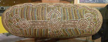
The traditional art of Australian aboriginal culture uses repetition and pattern almost exclusively both as decoration and to give symbolic meaning to images. The coolamon, or carrying vessel pictured below, is made of tree bark and painted with stylized patterns of colored dots indicating paths, landscapes or animals. You can see how fairly simple patterns create rhythmic undulations across the surface of the work. The design on this particular piece indicates it was probably made for ceremonial use.
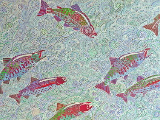
Rhythmic cadences take complex visual form when subordinated by others. Elements of line and shape coalesce into a formal matrix that supports the leaping salmon in Alfredo Arreguin’s Malila Diptych. Abstract arches and spirals of water reverberate in the scales, eyes and gills of the fish. Arreguin creates two rhythmic beats here, that of the water flowing downstream to the left and the fish gracefully jumping against it on their way upstream.
The textile medium is well suited to incorporate pattern into art. The warp and weft of the yarns create natural patterns that are manipulated through position, color and size by the weaver. The Tlingit culture of coastal British Columbia produce spectacular ceremonial blankets distinguished by graphic patterns and rhythms in stylized animal forms separated by a hierarchy of geometric shapes. The symmetry and high contrast of the design is stunning in its effect.
Time and Motion
One of the problems artists face in creating static (singular, fixed images) is how to imbue them with a sense of time and motion. Some traditional solutions to this problem employ the use of spatial relationships, especially perspective and atmospheric perspective. Scale and proportion can also be employed to show the passage of time or the illusion of depth and movement. For example, as something recedes into the background, it becomes smaller in scale and lighter in value. Also, the same figure (or other form) repeated in different places within the same image gives the effect of movement and the passage of time.
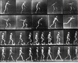
Visual experiments in movement were first produced in the middle of the 19th century. Photographer Eadweard Muybridge snapped black and white sequences of figures and animals walking, running and jumping, then placing them side-by-side to examine the mechanics and rhythms created by each action.
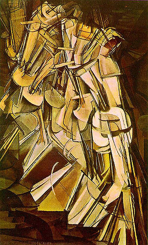
In the modern era, the rise of Cubism (please refer back to our study of ‘space’ in the Elements) and subsequent related styles in modern painting and sculpture had a major effect on how static works of art depict time and movement. These new developments in form came about, in part, through the cubist’s initial exploration of how to depict an object and the space around it by representing it from multiple viewpoints, incorporating all of them into a single image. Marcel Duchamp’s painting Nude Descending a Staircase from 1912 formally concentrates Muybridge’s idea into a single image. The figure is abstract, a result of Duchamp’s influence by Cubism, but gives the viewer a definite feeling of movement from left to right. This work was exhibited at The Armory Show in New York City in 1913. The show was the first to exhibit modern art from the United States and Europe at an American venue on such a large scale. Controversial and fantastic, the Armory show became a symbol for the emerging modern art movement. Duchamp’s painting is representative of the new ideas brought forth in the exhibition.
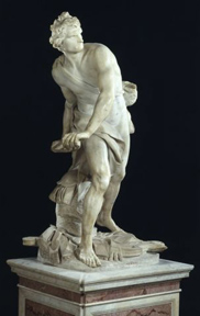
In three dimensions the effect of movement is achieved by imbuing the subject matter with a dynamic pose or gesture (recall that the use of diagonals in a composition helps create a sense of movement). Gian Lorenzo Bernini’s sculpture of David from 1623 is a study of coiled visual tension and movement. The artist shows us the figure of David with furrowed brow, even biting his lip in concentration as he eyes Goliath and prepares to release the rock from his sling.
The temporal arts of film, video and digital projection by their definition show movement and the passage of time. In all of these mediums we watch as a narrative unfolds before our eyes. Film is essentially thousands of static images divided onto one long roll of film that is passed through a lens at a certain speed. From this apparatus comes the term movies.
Video uses magnetic tape to achieve the same effect, and digital media streams millions of electronically pixilated images across the screen. An example is seen in the work of Swedish Artist Pipilotti Rist. Her large-scale digital work Pour Your Body Out is fluid, colorful and absolutely absorbing as it unfolds across the walls.
Continuous Narrative
A kind of implied time can be seen in art that employs the device of a continuous narrative. In this work a storyline is shown in more than one image but within the same work or on the same picture plane. Graphic novels often use this device. Even though we see the same characters side by side on the page we understand that they are moving forward in time along with their story.
Licensing & Attributions
© Saylor Academy 2010-2018 except as otherwise noted. available under a Creative Commons Attribution 3.0 Unported license. Third-party materials are the copyright of their respective owners and shared under various licenses. Saylor Academy and Saylor.org® are trade names of the Constitution Foundation, a 501(c)(3) organization through which our educational activities are conducted.
CC licensed content, Shared previously• Artistic Principles. Authored by: Christopher Gildow. Located at: https://learn.canvas.net/courses/24/modules#module_19. Project: Open Course Library. License: CC BY-NC-SA: Attribution-NonCommercial-ShareAlike• Golden Ratio. Located at: https://youtu.be/fmaVqkR0ZXg. License: All Rights Reserved. License Terms: Standard YouTube license
