8 Graphic Design
Graphic designers use all of the same Elements and Principles that other artists do when creating their work. They make preliminary drawings, arrange elements on a 2-Dimensional surface or support that would be called a composition in a painting but in graphic design is called a layout, and finally manipulate the elements of that layout with an eye to color, scale, balance, unity and variety, and many of the other things we’ve studied in other media.
But there is one significant difference between so-called “fine art” and graphic design. We have discussed art as a form of communication, although what it communicates and how it’s received is often as dependent on the viewer as it is the artist’s intention. In graphic design this isn’t the case. Graphic design is created to carry a very specific message to an equally specific audience and if it doesn’t it isn’t successful (and neither will the designer be). Corporations, small businesses and individuals trying to reach a specific audience with something to sell hire designers to create an image that will communicate to that audience what the company wants their potential clients to think about them.
Graphic design had its beginnings in the 15th century with the invention of moveable type. This was the first time in history that written material didn’t have to be copied by hand, an expensive and time-consuming process. Now multiple editions of a text could be made available quickly and at a price even a 15th century person could afford – at least some of them. Images still had to be printed on a different press using a relief process, usually, but text could be added even to that. This made the ability to disseminate information to a wider audience possible, but it took another significant development for advertising to become necessary. The Industrial Revolution in Europe and America made the proliferation of product a fact of life. More things to sell meant the need to reach a wide population of potential buyers and so modern advertising was born. Those advertisements needed to be created and the more eye-catching the better, so graphic design began to find its way into the modern world as well.
Semiotics or the Communication of Signs
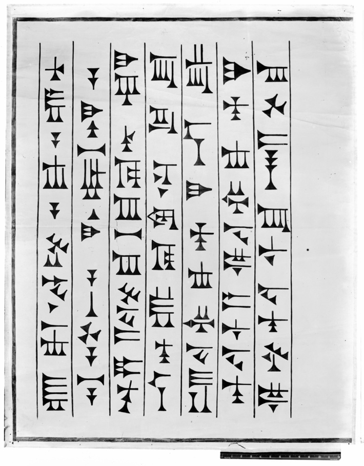
All written communication does so by means of signs. We understand these signs only because we have agreed on the meaning and codified that meaning. Letters combined into words have meaning but only if they are in a sign system we have been taught. The earliest forms of writing were pictographic – drawings that suggested the meaning that was being conveyed. This graphic copy of cuneiform script from Ninevah in Mesopotamia began as mimetic drawings but evolved into simpler versions that were quicker to record as you see below.
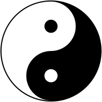
Many of the familiar signs from earlier periods are still understandable today, but others have taken on very different meanings. The Yin/Yang symbol is an ancient sign related to Chinese philosophy. The idea of the balance of opposites such as male/female, good/evil, light/dark is embodied in this image and we basically understand it as such today.
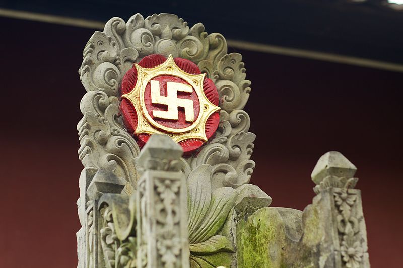
From as early as the 3rd millennium BCE in India and Central Asia the swastika was a symbol of good fortune. Examples can be found on illustrations, sculpture, and other objects from that period until the 20th century. When it – or a version of it – was coopted by the Nazi regime as their symbol it became synonymous with the actions of that evil period and the earlier, benevolent meaning was lost.
Graphic Designers use the idea of signs to communicate meaning. Probably the most frequent item designers are asked to create for clients are logos. Logos are symbols that carry the corporate identity of a company so designers must make them easily identifiable, unique, and having in some way the character of the company they represent.
One of the most successful designers in America in the 1950s and 60s was Paul Rand. Rand created some of the most iconic logos in design history – versions of which are still used by the companies today. The easiest way for a corporation to retool their image is a redesign of their logo, but unless the idea is to completely ditch what the world associates with that company and logo, most companies want a version of the old logo so that it looks fresh and modern, but still reads as the symbol of the company people already know and trust. Here are two of Rand’s logos that you may recognize since they have changed little since his initial design.


Typography
One of the first choices a designer makes when creating a corporate identity is which typeface to use. Type style is a great conveyer of meaning – a face that works for an oil and gas company would probably be the wrong choice for a line of baby food or a French restaurant. There are thousands of typefaces now and more being designed every year. When type had to be physically “set” it meant that metal type had to be produced – multiple typefaces would have been quite expensive. Today a designer can create a digital face and make it available to the world at very little cost. Some typefaces are free, other specialty faces must be rented or purchased.
Moveable type was invented in Northern Europe in 1450. One of the first fine artists to turn his hand to this new technology was Albrecht Durer. Durer was a painter, printmaker, and proto-graphic designer. His design for letterforms showing the measurements needed to create an alphabet of matching shapes gives an idea of the things taken into consideration when planning a new font.
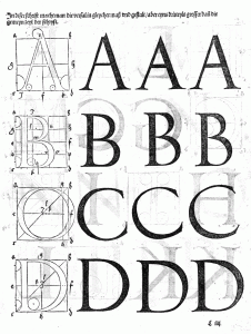
Note the tops of the “A”. The first one has a kind of scoop from left to right; the second comes to a sharp point; the third has a completely flat top. Durer has thought about the varying thicknesses of the letterforms from thick to thin. This kind of shape gives an elegant or decorative quality to the font. There are two basic letterforms: serifed and sans-serif. The serif is the little “tail” that extends beyond the edge of the letter. If a font has a straight “leg” that has no pointed extension to the side it is a “sans” serif (Fr. “no” serif). Helvetica is a sans-serif face. In a general way, sans-serif faces tend to read as more modern while serifed faces feel more Classical or refined.
Fine Art and Graphic Design
In the early days of the century graphic design was known as “commercial art”. This has fallen out of use for the most part because it’s recognized that: a. all art that is for sale is a commodity, or commercial, and b. all art uses the same elements of “design” whether it is for a specific client or for the artist’s own pleasure, and c. art made for any client is “commercial”. Leonardo da Vinci’s portrait of Lisa Gherardini (Mona Lisa) was commissioned by her husband and thus was commercial (even thought Leonardo never delivered the portrait to Gherardini – he was paid).
Having written all that, there is a cross-over between so-called “fine” art and art made for commercial purposes – and it goes both ways. Fine artists have created art for advertisements and artists have used the techniques and conventions of “commercial” art or advertising design to create art for museums and galleries.
Henri Toulouse-Lautrec was a 19th century artist from an aristocratic family. He had exhibited an interest in art at a young age and had been encouraged by his mother to study. Lautrec suffered from an undiagnosed condition that resulted in his legs ceasing to grow at a young age. Some have suggested that it was his physical appearance that led him to become an habitué of nightclubs and prostitutes. In any case, he did many paintings of men and women of the demi-monde and created posters to advertise some of the establishments he frequented – especially the Moulin Rouge.
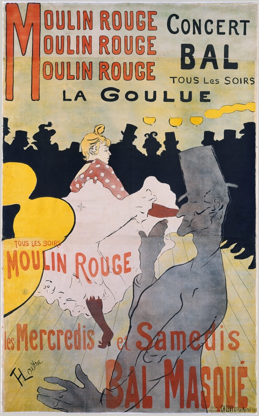
In this poster from 1891, Lautrec uses a narrow palette of primary colors – red, black, and yellow with tints of those hues – to describe not only the audience at the Moulin Rouge but also the main acts. La Goulue was the stage-name of Louise Weber, a can-can dancer often called “The Queen of Montmartre”. Her stage-name, La Goulue or The Glutton, came from her habit of finishing off patrons’ drinks as she danced around their tables. The can-can was considered a scandalous dance in the straight-laced 19th century because it exposed women’s underwear when they lifted and shook their skirts. Lautrec shows her in the middle of one of these dance moves. The other character in the poster – the tall man in grey – is Valentin, a contortionist who also performed at the cabaret. By repeating the name of the cabaret three times in the upper left corner Lautrec emphasizes the location; by repeating in large letters the “Bal Masque” in the lower right he achieves balance in the composition. The repetition of yellow globe-shapes across the surface also creates an implied line and unifies the work. These posters were said to be so popular that they disappeared from the walls where they were posted.
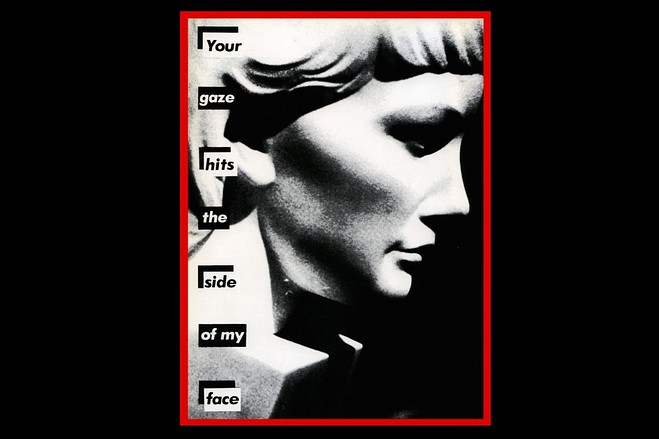
Barbara Kruger was born in New Jersey in 1945. She worked as a graphic designer during her early career, but turned to the creation of conceptual art and collage.
She began using her graphic design training and eye to create large-scale work that had a political bent. A feminist, she created images that referred to theories about the Gaze and the position of women in the culture.
In Your Gaze Hits the Side of My Face Kruger gives us typography that recalls the “ransom note” style of punk-rock record labels and a grainy image of a woman’s face that isn’t a woman at all but a sculpture with a blocky bottom. Her choice of words – Your Gaze Hits the Side of My Face – suggests the violence that was often at the bottom of the subjugation of women in the culture.
The kind of cool remove that is generated by the graphic red/black/grey color palette and the ironic choice of language was a Postmodern melding of graphic design and fine art and became Kruger’s trademark, so to speak.